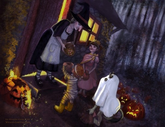
A Halloween Illustration by Kiri Østergaard Leonard
Sometimes it is a struggle to complete a piece.
I was recently working on a piece for my upcoming Trollkin calendar, that gave me a really hard time. I wish I could blame it on the piece itself, but to be honest the fault was my own; I made a long series of mistakes that made the piece even more difficult, but I also learned my lesson. That is what is important, that when you’re fighting against your own artwork, you sometimes need to take a deep breath and look at what is causing the difficulties. There are almost always lessons to be found in the struggle.
The first mistake I made was to not plan the image out properly with sketches and drawing. I didn’t do this because when I started the piece I didn’t have a clear idea of what I wanted to paint – instead I had three foggy ideas. I will let Chris Oatley explain what the problem is with this approach:
If the vision is still in your mind, it’s still blurry.
If the vision is still in your mind, it’s still just inspiration.
Sketches make your vision clear.
My three ideas were as follow:
1. Paint a Jack o’Lantern with wisps playing in it.
2. Paint a nighttime landscape with midnight’s fires and the Slaugh riding over the sky whilst a troll watches from afar.
3. Paint a Trick or Treat event.
I sketched out concepts for all three but couldn’t settle on anything final so I ended up combining #1 and #3. I’m still not sure that was a good choice. First I sketched out the Trick or Treat idea from an entirely different angle than what I ended up with but it just did not work. I sketched more and eventually settled on a scene I thought would be easy. At first I had many more children but I ended up cutting it down to just two.
I adjusted the values to make a more convincing night time scene, while I like the earthly tones, it just wasn’t working. I loved the idea of Little Red Riding Hood as one of the costumes but little Red was stealing far too much of the attention. She became the center of attention rather than the ghostly-clad troll.
I consulted a couple of my friends who also work as illustrators and received really good feedback. The best advice was from Eric Braddock who suggested I added in a third child and spread them out more, with the troll hiding in the back.
The new composition with the children spread out was far more successful, however I still felt like the composition was too still, almost too grounded so I ended up utilizing a bit of dutch-angle inspiration and tilted the image. Eventually I ended up with a final piece, but what a headache it was to get there. Next time all these issues should be worked out in the drawing phase before I even consider colour.

Final illustration: All Hallow’s Eve